TLDR: The most useful business card design ideas for a new business begin with one question: what should the recipient do next? Choose a single action—call, book, request a quote, view work, visit a location, or browse a menu—and build the card around it. Use the front for fast recognition and the back for supporting information, a clearly labeled QR code, or a useful reminder.
A business card is a small offline landing page, not a miniature company brochure. It should identify the business, explain the offer in plain language, and make the next step obvious. Decorative choices matter, but they should support that job rather than compete with it.
Choose a brand position before choosing a style
Starting with colors, fonts, and finishes is tempting because those decisions feel tangible. Positioning comes first, however. Decide what you want a new contact to remember when the card reappears in a wallet, desk drawer, or photo several days later.
A useful positioning statement combines the customer, service, and practical distinction. “Residential electrician” identifies a category. “Residential electrical repairs and panel upgrades” gives the recipient more help. “Same-day service” should appear only if the business can consistently honor that promise.
Match the visual direction to the position. A premium consultant may benefit from restraint and generous empty space. A children’s entertainer can use brighter color and more movement. A field-service company usually needs immediate legibility, a clear service area, and a phone number that is easy to find. Looking professional does not mean making every new business look like the same law firm.
Business card design ideas for a new business by goal
| Business goal | Front of card | Useful back-side content |
|---|---|---|
| Explain an unfamiliar service | Business name, plain-language service description, contact name | Three short service examples and one next step |
| Encourage bookings | Name, role, visual identity, booking prompt | Labeled QR code or short booking URL |
| Generate quote requests | Service category, phone or email, service area | What information to provide when requesting a quote |
| Show creative work | Distinctive visual identity and short specialty line | Portfolio prompt, QR code, and readable portfolio URL |
| Bring people to a location | Business name, category, neighborhood or city | Address, hours if stable, and directions prompt |
| Support field service | Service name, strong phone hierarchy, service area | License or credential details when relevant and verifiable |
| Promote food or hospitality | Business identity and concise concept | Menu prompt, location, and ordering path |
| Build referrals | Business identity and contact route | A simple instruction explaining who the business helps |
These are starting structures, not mandatory templates. A mobile pet groomer and an accounting practice should not use the same hierarchy merely because both are new businesses. The card should reflect where it is handed out and what the recipient is likely to need at that moment.
Give every element a job
Most new-business cards need four things: recognizable identity, a plain-language offer, a primary contact path, and a focused call to action. Additional details must justify the space they consume.
- Business name and logo, if the logo remains readable at card size
- Person’s name and role when a personal relationship matters
- A short description of the service or product
- One preferred contact method, made visually prominent
- A secondary contact method when customers genuinely need one
- A website, booking page, portfolio, menu, or location path
- A service area or address when geography affects the decision
- A focused instruction such as “Request a quote” or “View the menu”
Not every channel deserves equal emphasis. If appointments must be booked online, make the booking path prominent instead of allowing a general inbox, three social handles, and a phone number to fight for attention. If customers normally call from a job site, the phone number may deserve the strongest treatment.
Social handles are useful when the account helps someone evaluate the business—for example, a photographer’s portfolio or a bakery’s current work. They are less useful when the account is inactive or merely repeats information available elsewhere.
Choose one primary call to action
A call to action should complete the sentence, “After receiving this card, the right prospect should…” The answer might be “book an estimate,” “see recent projects,” or “save the emergency number.” It should not be “choose among six unrelated contact options.”
The best action depends on the handoff. A card distributed after a networking conversation can lead to a consultation page. A contractor’s leave-behind can explain how to request an estimate. A retail counter card might encourage the recipient to view a product catalog. This objective-first approach also helps determine whether business cards belong in a wider set of printed marketing materials for a small business.
Use QR codes as labeled shortcuts
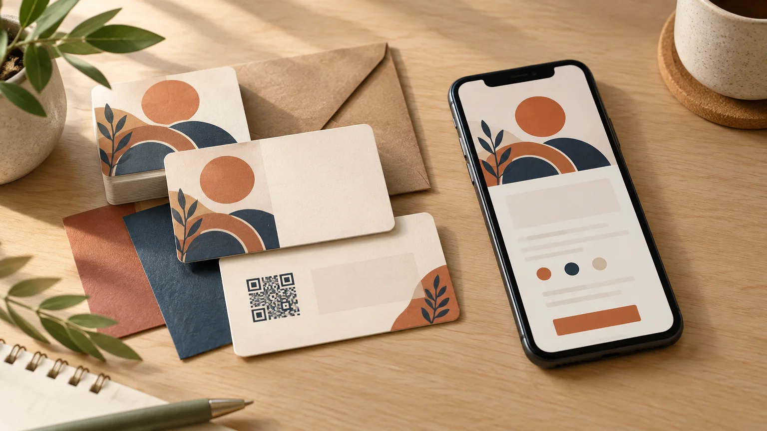
A QR code can remove typing, but the square itself does not explain why someone should scan it. Label it with the result: “View available appointments,” “See recent renovations,” or “Open the lunch menu.” The federal Section 508 guidance on accessible QR-code implementation recommends descriptive labels and an accessible alternative, such as an adjacent URL in print contexts. It also advises strong contrast and a destination where the next choice is clear.
Provide a readable fallback such as a short URL, email address, or phone number. That helps recipients who cannot or do not want to scan. Avoid vague labels such as “Scan me,” which describe the motion without explaining the reward.
Code construction, clear space around the code, color and contrast, physical size, and production quality can all affect the readability of printed two-dimensional codes. Keep the code visually separate from nearby text, avoid decorative interference, and test a printed proof with multiple phones before approving the full run. A successful design-file scan is not a substitute for testing the physical card under ordinary lighting.
Link to a stable destination. A focused mobile-friendly page is usually more useful than a generic homepage when the card promises a specific action. If the destination may change, use a redirect you control rather than committing a large print run to a fragile campaign URL.
Make the back side earn its place
A double-sided card is worthwhile when the second side reduces clutter or adds something the recipient will use. It can hold a QR code, appointment instructions, a short service list, a referral note, care information, or a concise explanation of what to prepare for a quote.
The back should not become overflow storage for every fact that failed to fit on the front. Keep a clear hierarchy on both sides. If the information changes often—prices, temporary offers, staff availability, or seasonal hours—send readers to a maintained destination rather than printing details likely to become stale.
A one-sided card remains a sound choice when the business is easy to understand and has one straightforward contact route. Empty space can also leave room for a handwritten estimate reference, appointment time, product name, or personal note.
Let print choices support the positioning
Stock and finish affect handling, writing, contrast, and the overall visual impression. Choose them according to how the card will be used, not because an upgrade sounds premium.
- An uncoated or writable area is helpful when staff add appointment details or personal notes.
- A restrained finish can suit a card built around typography and generous empty space.
- A more durable treatment may be sensible when cards travel in toolboxes, delivery bags, or outdoor event kits.
- Rounded corners or an unusual shape can reinforce an identity, but only if the card remains easy to store and the printer supports the format.
- Dark backgrounds require careful attention to contrast, fine type, and potential edge variation.
- Special effects should emphasize a meaningful element rather than decorate every available surface.
Ask the chosen printer for its current template and available options before finalizing the design. If production support, proofing, turnaround, or quantity flexibility matters, use a practical checklist for choosing a local print shop rather than selecting on unit price alone.
Avoid the mistakes that make cards harder to use
Crowding is the most common problem. Printing every possible detail is not the same as communicating clearly. Small type, weak contrast, long URLs, unexplained icons, and several competing calls to action make the recipient work harder.
- Do not make the logo large enough to push the actual offer into tiny text.
- Do not rely on a job title when it fails to explain what the business provides.
- Do not use a decorative typeface for phone numbers, URLs, or other action details.
- Do not place essential text or thin borders too close to the trim edge.
- Do not use a QR code without stating what it opens.
- Do not send people to an unfinished website simply because a URL looks expected.
- Do not print a large quantity until names, numbers, links, spelling, and code scans have been checked.
Prepare the final file for production
Build from the printer’s specifications rather than assuming every supplier uses the same setup. Confirm finished size, bleed, safe area, accepted file format, color requirements, image quality, and whether fonts must be embedded or converted. The print-ready file preparation guide explains how those checks apply to business cards and other collateral.
- Request the current production template from the printer.
- Confirm the final wording, phone number, email address, and URL.
- Open every link and test every printed-code destination.
- Print a physical size mockup and check legibility without zooming.
- Keep essential text and logos inside the printer’s safe area.
- Extend background colors or images through the required bleed area.
- Review both sides in the correct orientation.
- Ask another person to proof names, numbers, spelling, and the promised action.
- Approve quantity and finish only after the content is stable.
Prints Jackson currently lists standard and premium business cards among its offerings and states that it can assist with basic layout and print-preparation issues. Confirm the current sizes, stocks, finishes, quantities, proofing process, and turnaround before designing around a particular option.
Write a one-sentence card brief before designing
Finish the planning stage with one sentence: “This card is for [recipient], handed out at [context], and should lead them to [action].” For example: “This card is for homeowners after an introductory conversation and should help them request a repair estimate.” That brief settles many design arguments quickly.
Once the objective is clear, choose the minimum content needed to support it, sketch the front and back, and test a paper mockup. A new business does not need a card that says everything. It needs a card that helps the right person remember the offer and take one sensible next step.