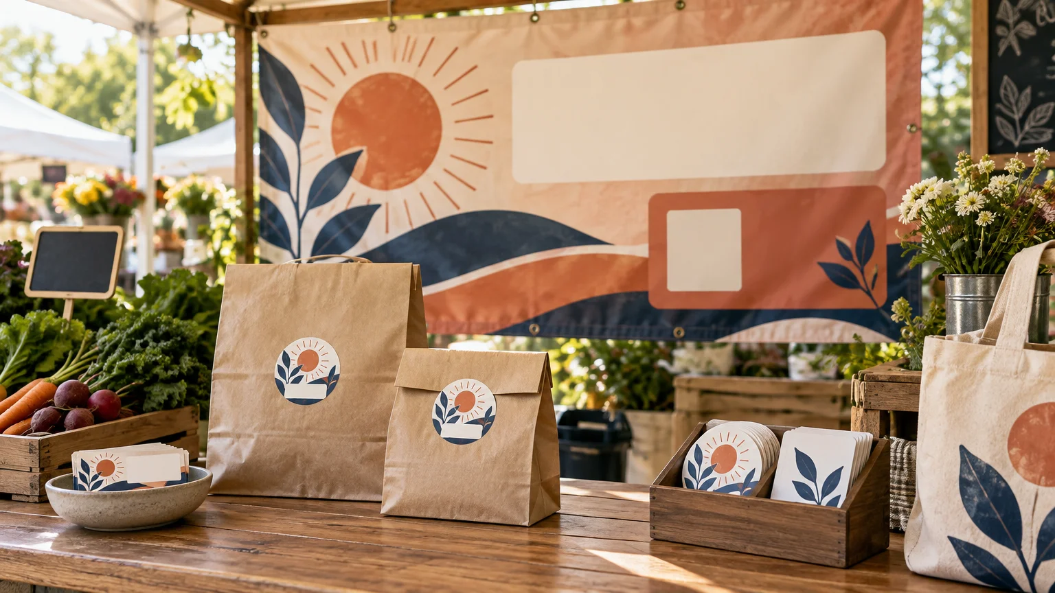
TLDR: Use banners to make the campaign visible from a distance and stickers to carry it beyond the location. Both should share the same campaign identity and primary action, but they should not use identical layouts. Decide where each piece will appear, simplify the message for its viewing conditions, and use separate tracking links when you need to compare traffic from banners and stickers.
Planning custom stickers and banners for the same campaign works best when each format has a specific job. A banner might direct people to an entrance, announce an offer, identify a sponsor, or make a booth recognizable. A sticker might travel home on packaging, appear in a volunteer kit, seal a bag, or give someone a compact reminder to visit a page later.
The mistake is treating the sticker as a miniature banner. A design that works across a storefront or above an event table may become unreadable when reduced to a few inches. Build one campaign system, then create two compositions adapted to how people will encounter them.
Start with one objective, not two print products
Before discussing banner sizes or sticker shapes, write down the campaign objective. What should someone do after seeing either piece? Useful answers include visiting a launch page, entering an event, claiming an offer, donating, booking an appointment, joining a mailing list, or remembering a product name.
Choose one primary action whenever possible. A banner asking people to scan, call, follow three social accounts, read six features, and visit a counter is not providing options; it is assigning homework. The sticker should not introduce another unrelated assignment.
- Audience: Who will see or receive the materials?
- Encounter: Will they see the banner while walking, driving, waiting, shopping, or attending an event?
- Action: What single next step matters most?
- Destination: Where does the QR code, short URL, or instruction lead?
- Timing: Which dates, prices, locations, or offer details could become stale?
- Measurement: Does the team need to distinguish banner responses from sticker responses?
These decisions form the campaign brief. They should be settled before the designer starts adapting logos, illustrations, or copy.
Assign a different role to banners and stickers
| Format | Primary job | Best content | Common placements |
|---|---|---|---|
| Banner | Attract attention and orient people | Campaign name, short benefit or instruction, primary CTA, essential date or location | Storefront, entrance, booth, stage, fence, registration area |
| Sticker | Create a portable reminder or functional label | Recognizable mark, short phrase, compact CTA, QR code when practical | Packaging, handouts, giveaway tables, volunteer kits, product inserts |
| Both together | Create recognition and repetition | Shared colors, type style, campaign phrase, visual motif, destination | Locations where a person can see the message and later take part of it away |
A banner has to survive distance, movement, glare, visual competition, and limited attention. Its message should usually be understood in layers: campaign identity first, core message second, action third. Fine print belongs only when it is necessary and can be read under the actual viewing conditions.
A sticker is handled at close range, but its small area still demands restraint. A giveaway sticker may work best as recognizable artwork with a short campaign phrase. A packaging sticker may need a functional role such as identifying a product, sealing tissue, or directing the buyer to care instructions. For more packaging applications, see custom labels and packaging print ideas for small businesses.
Coordinate the designs without making them identical
The campaign should look related across both pieces. Keep a shared palette, logo treatment, headline idea, illustration style, and call-to-action language. Then change the hierarchy for each format.
For example, imagine a community fundraiser using the phrase “Build the New Playground.” The entrance banner could say “Community Fundraiser Today,” show the campaign phrase, and point visitors toward check-in. The giveaway sticker might feature a simple playground icon and the campaign phrase. It does not need the entrance arrow, event schedule, sponsor row, or full address.
Design a small sticker at its final printed dimensions rather than building a large composition and shrinking it at the end. Fine outlines, long URLs, thin type, and tiny gaps can disappear or become difficult to read. If recognition and keepability are important, start with one clear sticker idea instead of squeezing the complete campaign brief into the shape.
Choose placement before estimating quantities
Quantities should come from distribution points, not an assumed banner-to-sticker ratio. Map the campaign physically and count what each location needs.
- List every banner position, including entrances, decision points, booths, stages, fences, and backup locations.
- Record whether each banner will be viewed indoors or outdoors, at close range or from a distance, and while stationary or moving.
- List each sticker distribution channel: packages, attendee bags, checkout counters, volunteer kits, mailers, handouts, or merchandise tables.
- Estimate sticker quantities from expected packages, attendees, shifts, or distribution periods, then add a reasonable allowance for damage and operational changes.
- Decide who installs each banner, who replenishes stickers, and what happens to dated materials after the campaign.
Placement also determines the appropriate format. Individual die-cut stickers can work as giveaways, kiss-cut stickers are easier to peel from a backing, sheets can group several designs, and labels may suit repeated packaging application. Readers comparing production options can explore custom sticker formats based on how the pieces will be distributed. If the campaign is large enough that color, cut accuracy, or adhesive behavior could create an expensive surprise, consider a sample or small test order before committing to the full quantity.
Use QR codes as a route, not decoration
A QR code needs a reason to be scanned. “Scan to donate before Friday,” “Scan for the event schedule,” and “Scan for care instructions” are clearer than a code floating beside a logo. The destination should match the promise and work well on a phone.
Keep the code visually separate from nearby text and artwork. GS1 guidance calls for a quiet zone of at least four X-dimensions on every side of a QR code and warns that nearby graphics or colors can interfere with readability. Its guidance on color and QR-code placement is useful when a code must sit inside a busy campaign design.
Test the actual printed proof or production sample, not only the code displayed on a monitor. Scan it with multiple phones under conditions resembling the final placement. For a banner, test from realistic viewing positions. For a sticker, test it at final size and after application to the intended surface, especially if curvature or reflective artwork could affect scanning.
Track banners and stickers separately when it matters
The two formats can lead to the same landing page while using different tagged URLs. Google Analytics documents UTM parameters as a way to identify campaign traffic and recommends consistent naming; utm_content can distinguish individual creatives or placements within the same campaign.
A simple naming plan might keep the campaign and source consistent while changing the content value:
- Banner URL: utm_campaign=spring_launch and utm_content=storefront_banner
- Sticker URL: utm_campaign=spring_launch and utm_content=package_sticker
- Event banner variation: utm_campaign=spring_launch and utm_content=event_entrance_banner
Each tagged URL can generate its own QR code even though all versions open the same page. This lets the campaign team compare recorded visits by format or placement. Keep names lowercase and consistent so “Storefront-Banner,” “storefront_banner,” and “banner1” do not become three accidental categories.
Do not place customer names, email addresses, or other personally identifiable information in campaign URLs. Google’s analytics guidance explicitly cautions against sending personally identifiable information through URL campaign parameters. Tracking should identify the campaign piece, not the individual holding it.
Separate codes are not mandatory. If the campaign only needs one easy route and nobody will review source-level analytics, one shared code may be simpler. If measurement affects future placement or budget decisions, separate codes are worth the small amount of setup.
Three ways the combination can work
Storefront promotion
A window or entrance banner announces the offer in a few words and points people toward the store or campaign page. Stickers placed in shopping bags repeat the visual identity and provide a later-use code. Put the full terms on the landing page rather than turning either print piece into a wall of conditions.
Community fundraiser
Banners identify registration, donation, activity, and sponsor areas. Stickers become attendee keepsakes or volunteer identifiers. Directional banners may need arrows and location-specific wording, while the keepsake sticker should avoid information that becomes meaningless as soon as the event ends.
Product launch or market event
A booth banner helps people recognize the product from across the room. A package seal or giveaway sticker carries the launch symbol and a compact CTA. If several product variants share one booth, the banner can present the umbrella campaign while stickers distinguish individual products through color or short labels.
Run one proofing process across the campaign
Review the banner and sticker together before approving either one. Side-by-side proofing catches mismatched dates, slightly different campaign names, inconsistent colors, outdated URLs, and calls to action that lead to different places.
- Confirm campaign name, dates, offer wording, locations, sponsor names, and required terms.
- Open every URL and verify that the destination matches the printed promise.
- Scan every QR code from a printed proof at its intended size and distance.
- Check that QR codes have sufficient clear space and contrast.
- Review banner hierarchy at a reduced on-screen view and from several steps away from a physical proof when available.
- Inspect sticker text and fine artwork at final printed dimensions.
- Confirm quantities by placement or distribution point.
- Verify material, finish, cut style, finishing, installation method, and usage conditions with the selected printer.
- Assign one person to approve the complete campaign rather than collecting uncoordinated approvals for each item.
- Save a final approved file set with clear version names.
Prints Jackson currently identifies a clean PDF as its preferred file format and notes that PNG and JPG files can sometimes be used, although sharpness may be affected. File requirements can differ by printer and product, so request the specifications before export and use this print-ready file preparation guide to catch common setup problems.
Build the campaign brief before requesting quotes
The most useful next step is a one-page brief listing the objective, audience, primary CTA, landing page, banner placements, sticker distribution points, required dates, quantities, and approval deadline. Attach rough layouts or a content hierarchy even if the final artwork has not been produced.
When custom stickers and banners for the same campaign share that foundation, the pieces reinforce one another without becoming copies. Let the banner handle visibility and navigation. Let the sticker handle portability, packaging, or continued recognition. Then proof both as one system so the campaign says the same thing wherever people encounter it.